Types of metrics
- Series Metrics: Data trends or comparisons, visualized as pie, bar, horizontal bar, line charts, or tables.
- Number Metrics: Single values with optional targets, shown as gauges or simple numbers.
- Comparison Metrics: Compare two numbers, highlighting improvements or decrements.
Series
Series metrics involve a sequence of data points collected over a period or categorically. This type allows for detailed analysis and visualization of trends, changes, and progressions in your data. For example, tracking monthly visitors over a year.
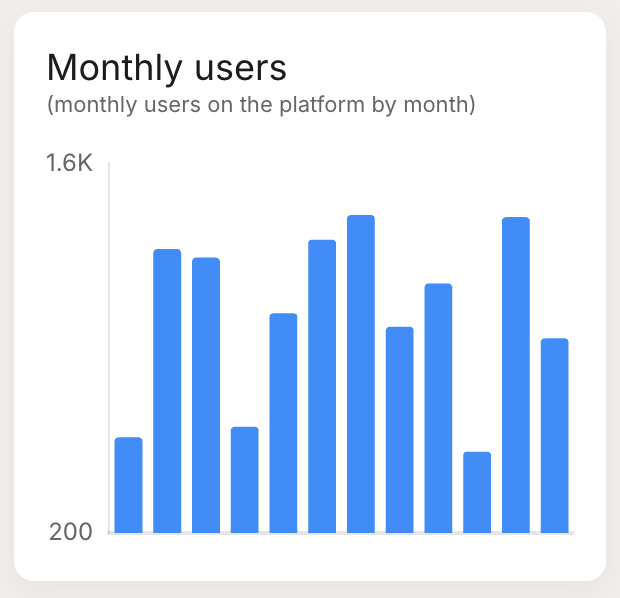 | Bar Chart: Visualizes data points as vertical bars, useful for comparing categories. |
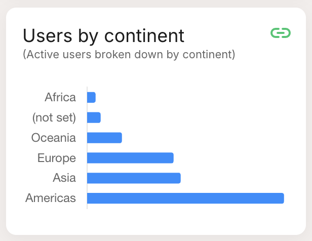 | Horizontal Bar: Similar to the bar chart but with horizontal bars, ideal for long category names. |
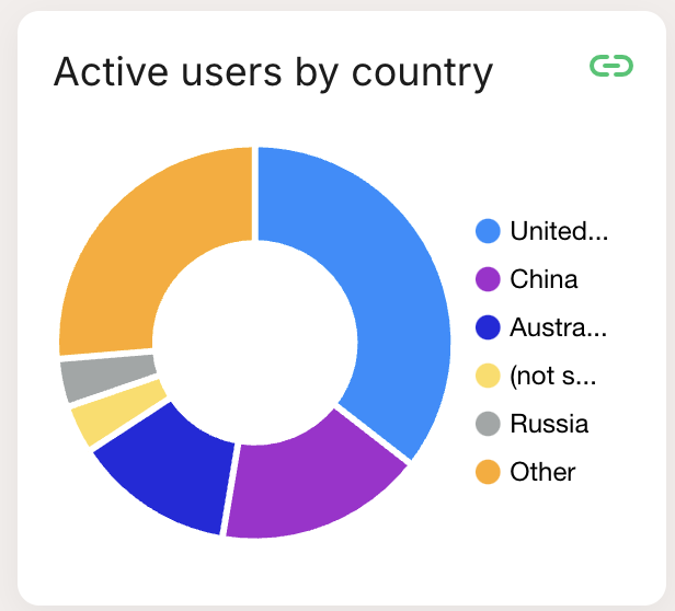 | Pie Chart: Displays data as slices of a pie, showing relative proportions. |
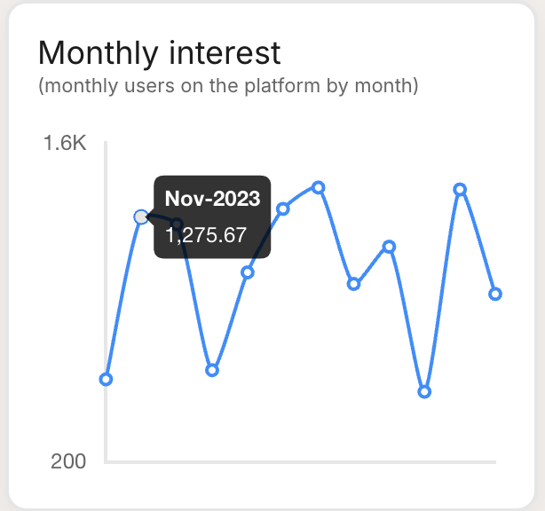 | Line Chart: Plots data points on a line, best for showing trends over time. |
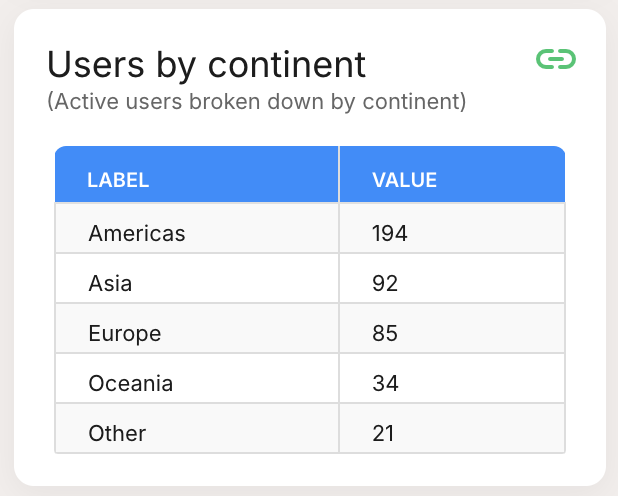 | Table: Lists data points systematically, suitable for detailed viewing. |
Number
Number metrics represent a single, standalone data value. This type is ideal for key figures or summary statistics that need to be highlighted, such as total number of users, one-time sales figures, or overall engagement rates.
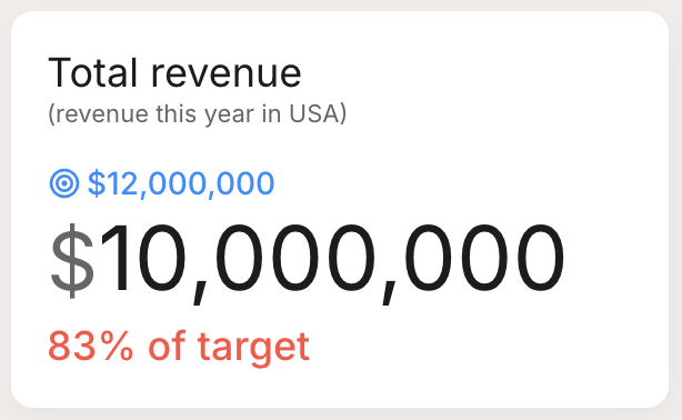 | Number: Shows a single value prominently, ideal for displaying essential figures like total users or one-time sales. |
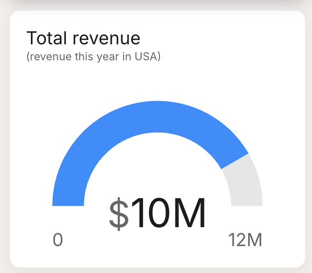 | Gauge: A semi-circular gauge that shows the value relative to a target value, perfect for giving a quick visual of performance against goals. |
Comparison
Comparison metrics allow you to compare two or more data points against each other. This type is perfect for side-by-side evaluations, such as comparing revenues from different months or contrasting user engagement between various features or campaigns.
 | Comparison: Displays a number with a percentage change below, ideal for showing improvements or declines over a period. |
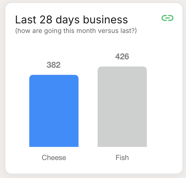 | Bar Comparison: Uses bars to compare different data points visually, making it easy to see which data point performs better. |